1
- Tapping on the Magnifying Glass icon on your dashboard allows you to search for entries, tags, locations, etc.
- Tapping on the Plus Sign allows you to add an entry.

2
The elements on the dashboard actively react to your glucose levels. The graph (1) and diabetes monster (3) change color with your average blood glucose for the day, and the tile (2) for your blood glucose average of the day changes colors as that value changes.

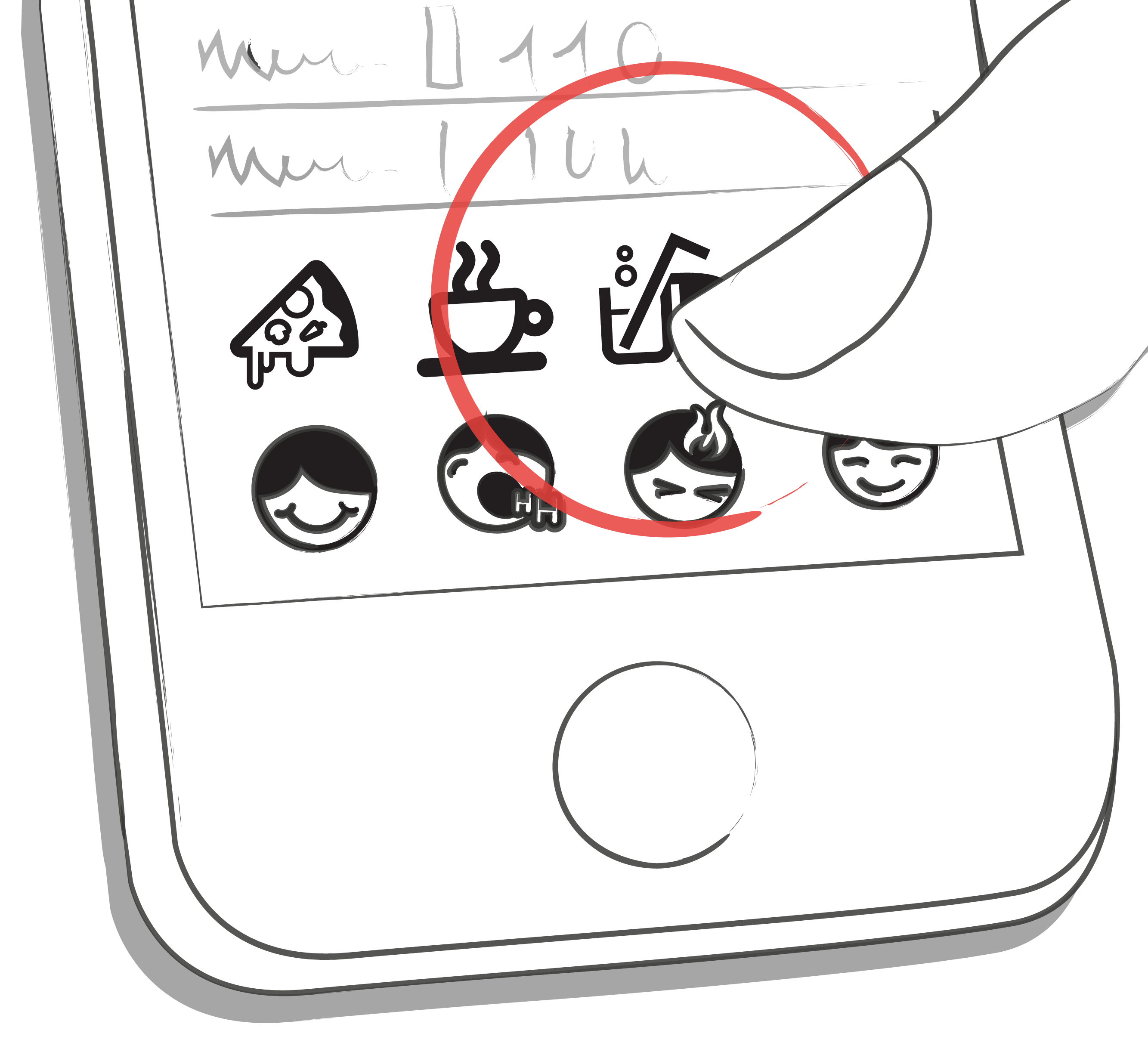
3
Each tag in the new entry screen describes a situation, scenario, some context, a mood, or an emotion. There is a text description of each tag directly below each icon.
4
- Red: Blood glucose not in target range
- Green: Blood glucose in target range
- Orange: Blood glucose is not great but ok

5
- Blood glucose, weight, blood pressure, HbA1c, Ketone
- Insulin
- Pills
- Food
- Activity
